
Optimising Cross-Product Navigation
My Role — User testing, Prototyping, Journey mapping, Insight gathering, Cross functional delivery, Stakeholder management
Impact
£341m
Casino Turnover since integration
£12.5m
Casino Grosswin since integration
3.4×
More users switched to Casino
Introduction
Multi-product customers, those who play both Sports and Casino, are the most valuable segment in the business. They generate more revenue than Casino-only players. Despite that, converting Sports customers to Casino had been a persistent failure point for years. The opportunity was sitting in the data. This is the story of how I led the design to fix that — iteratively, using data and research at every stage.
The hypothesis
14% of Sports-only customers were already playing Casino, with competitors, not us. Many more said they were interested but held back by friction — not knowing where to start, worrying about losing money, not trusting the system.
The opportunity wasn't to push customers toward Casino. It was to reduce the barriers for the ones already open to it. And to do that without hurting the Sports experience they were already invested in.
From problem to concept
Before anything went into Figma, we ran a short cross-functional workshop with the PM, researcher, analyst, and engineering. Low-fi sketching, nothing precious — the goal was to get everyone's assumptions on the table and agree a direction as a team rather than have design disappear and come back with something.

Output from our ideation workshop
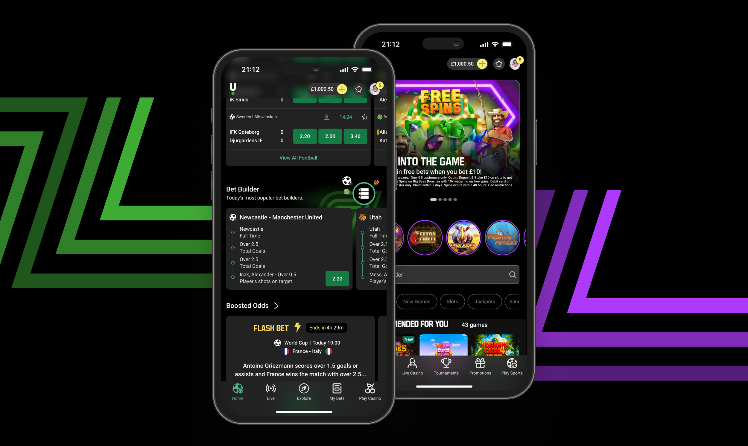
That session surfaced the key constraint early: whatever we built had to sit within the existing navigation without disrupting the Sports experience. It also got engineering buy-in on the approach before any detailed design work started, which made the rest of the process significantly faster. The output was a product switcher in the top navigation — a low-friction entry point to Casino for Sports customers.
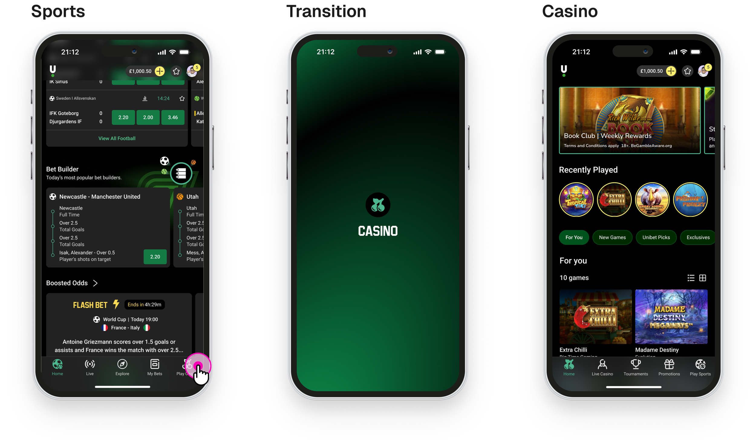
The user flow — V1
Testing the concept
We set up an A/B test with our analyst, agreeing KPIs and guardrails upfront: any Casino uplift had to be additive, not cannibalised from Sports. That framing wasn't just good practice, it was how we kept internal sceptics onside. If Sports had taken a hit, the project would have been pulled.
The test showed it worked. Cross-session navigation between Sports and Casino increased, Casino engagement lifted, and Sports held steady. V1 validated the concept. But click-through to Casino was lower than we'd hoped, the switcher was being seen, not always used.
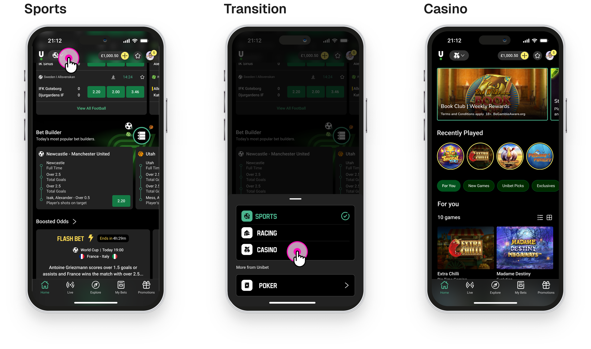
With that signal, we explored an alternative approach: moving the toggle out of the top navigation entirely and into the bottom nav bar, where mobile users naturally expect primary actions to live. We had a direction, now we needed to validate it.
Re-design and validation
We brought in the UX researcher to test both designs with real customers. The question wasn't "how do we improve the design?" — it was "how do our customers actually think about moving between products, and which of these two approaches fits that better?"
Unmoderated testing across four markets (UK, NL, SE, FR) with 45 participants. Two prototypes — the existing top switcher and a new one-tap toggle in the bottom navigation bar.
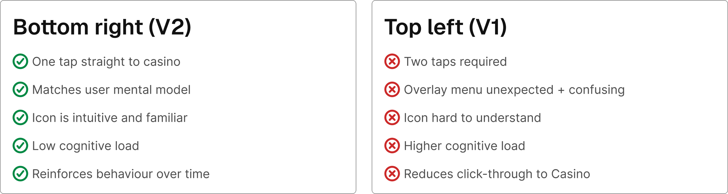
The findings were clear:
Users think in two hubs — Sports and Casino. The top switcher presented a menu. Users expected an instant action. The bottom draw added cognitive load to something that should have been seamless.
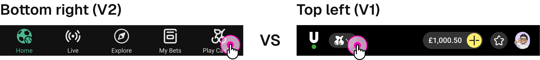
The bottom nav is where mobile actions live. The top-left position inherited web logic. It required a thumb stretch and an extra decision. Moving the toggle to the bottom-right put it exactly where users expected primary actions to be.
Speed is the feature. Every market, every participant — what they wanted was fast and obvious. One-tap won because it did exactly what users expected, first time.
This gave us more than a design direction. It gave us the evidence to move internal discussions off opinion and onto what customers had actually told us.
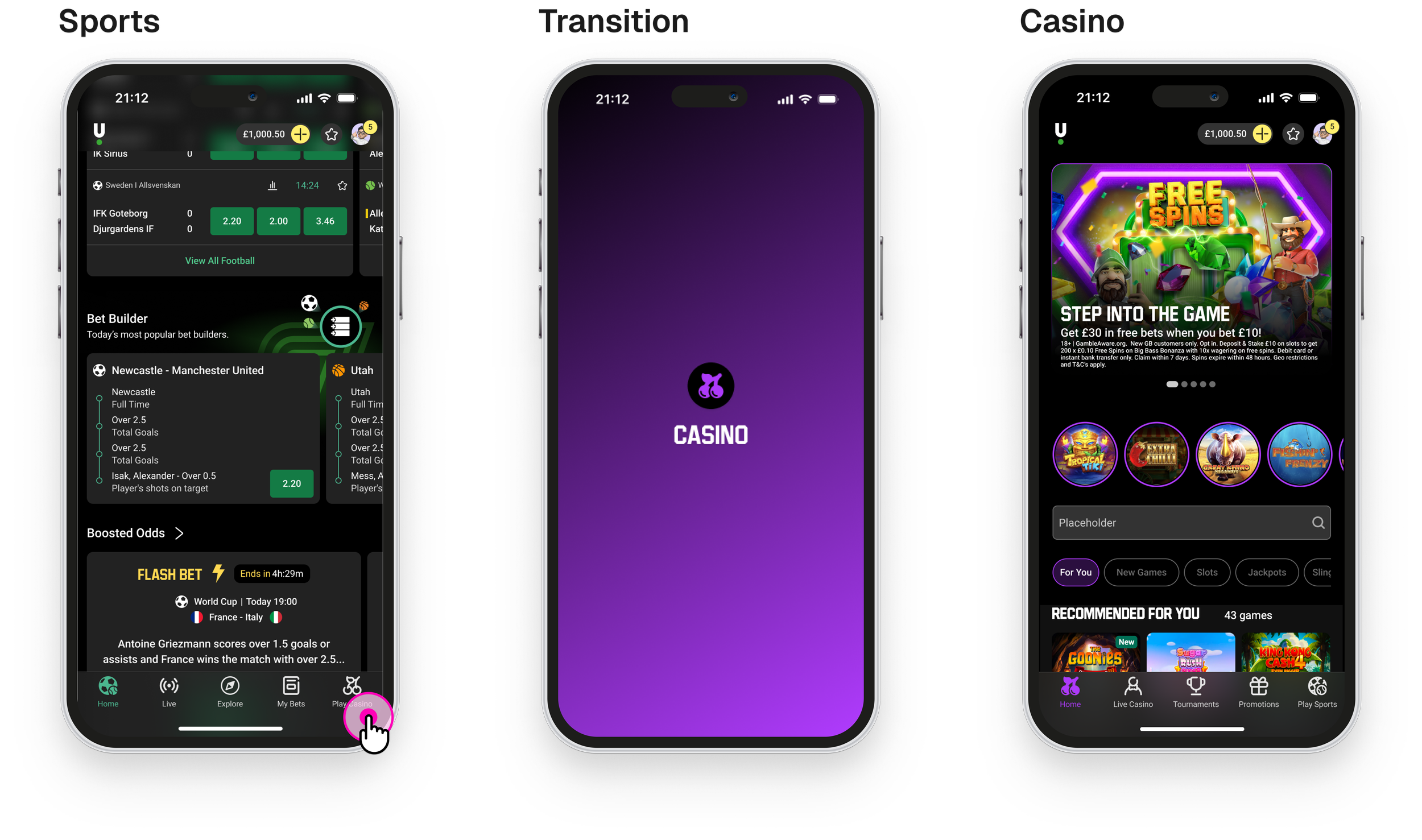
The user flow — V2
Proving the value
With the qual research confirming the design direction, we ran an A/B test against V1 — the same analyst, the same KPIs, the same guardrails. The new bottom nav toggle against the original top switcher, across the same markets.
The result was unambiguous: 3.4× more users switched to Casino via the new bottom nav than the original top switcher. With that confirmed, we rolled out across six markets. Since launch, the Sport App has generated £341m in Casino Turnover and £12.5m in Casino Grosswin — with >£2.5m estimated as net new revenue from customers who wouldn't have played Casino otherwise. Sports engagement stayed flat. The guardrails held.
What's next
The research surfaced one finding we hadn't fully resolved: users could switch between Sports and Casino, but didn't always register that they had. The two experiences looked too similar. As one participant put it — "it looks very similar, I would like to see some change in colours." This wasn't just a navigation problem. It was a brand problem.
We're now working closely with the brand team to visually differentiate the Casino experience from Sports — giving Casino its own identity that feels distinct but still part of the same app. This aligns with broader CX feedback we've seen over time that Casino should feel more playful and expressive than Sports. The brand team has produced initial concepts, and the timing works well — they're already partnering with the VP of Marketing on a wider push to position Casino as a more differentiated product. What started as a navigation insight has opened up a genuine cross-team creative collaboration.
The user flow — V3 (concept)
In parallel, we're running a design sprint with engineering to explore the switcher through the lens of iOS 26. Using Xcode Connect, we're looking at how design and code can be optimised simultaneously — rather than the traditional handoff where intent gets lost in translation. It's an experiment in how close design and engineering can get when they're working in the same tools, on the same problem, at the same time.
Prototyping in Xcode — V3 (concept)
What this shows
Opinion vs. evidence. There were internal views on what customers wanted. The research didn't just inform the design — it gave us the tools to move the conversation onto better ground.
Additive by design. Every phase was built around the same constraint: grow new behaviour without hurting existing value. That discipline is what kept the project trusted through each iteration.
Cross-functional leadership. The researcher, product manager, analyst, brand team, and engineering all shaped this at different points. The best outcomes came from working across functions, not alongside them — and the UX role was to hold that thread throughout.