
Improving navigation through user research
My Role — User testing, Insight gathering, Prototyping, Journey mapping, Stakeholder management
Impact
3x
Increase in user success rate
+10
CSAT post release
-15%
Users contacting customer support
Introduction
With the introduction of the Kindred Web Platform, our team saw both a challenge and an opportunity. We weren't just rebuilding a website—we were rethinking how users navigate our products across all brands and markets.
This wasn’t just about design; it was about shifting toward a user-centered mindset in a tech-led environment. By collaborating closely with the User Research team, we developed a rigorous methodology to identify core navigation pain points and define a scalable solution that improves the overall user experience.
Framing the problem
When we began, we lacked solid insights into how users interacted with our navigation system. Rebuilding the legacy structure without evaluating its effectiveness felt counterproductive. Instead, we made the decision to start with research, working across design, research, and engineering to define a better path forward.
Research methodology
With the help of our Lead User Researcher — we set up tree testing + card sorting across several markets. This allowed us to remove the visual aspect of the website and rely on our users to sort the navigation into categories. The advantage of this type of testing is scale (the combined sample size was 300 users), this was essential to provide us with the quantitative data we needed to gather significant results.
We also ran qualitative (usability) tests, in parallel to identify common patterns and pain points with the existing solution. While the sample size is smaller (10-15 users per test) it allowed us to create user profiling (different behaviour depending on age / nationality). It also provided verbal confirmation of the problems we identified in the quantitative tests.
Key findings
Our research revealed several consistent pain points:
Inconsistency between global and on-page navigation.
50% of users didn’t understand how to use on-page navigation.
Redundant product categorization caused confusion.
Underrepresented products were hard to locate.
“Only 1 in 2 users successfully use the on-page navigation.”
Designing the solution
The research pointed clearly to one conclusion: consistency and depth matter.
We introduced a nested navigation structure that better aligned on-page navigation with the global hierarchy. While initially perceived as more complex (due to additional taps), the structure made more logical sense to users—and performed better in tests.
A major decision was to merge “Casino” and “Live Casino” categories. Tree testing indicated users grouped them naturally. Despite some internal skepticism, user behavior validated this deeper, more structured design.
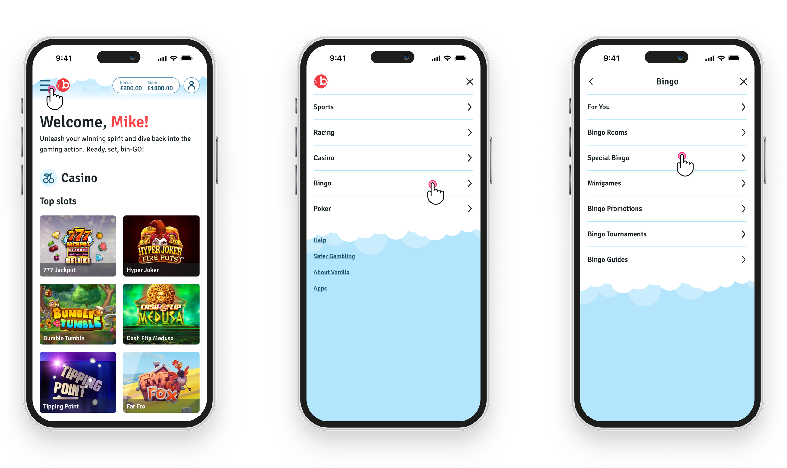
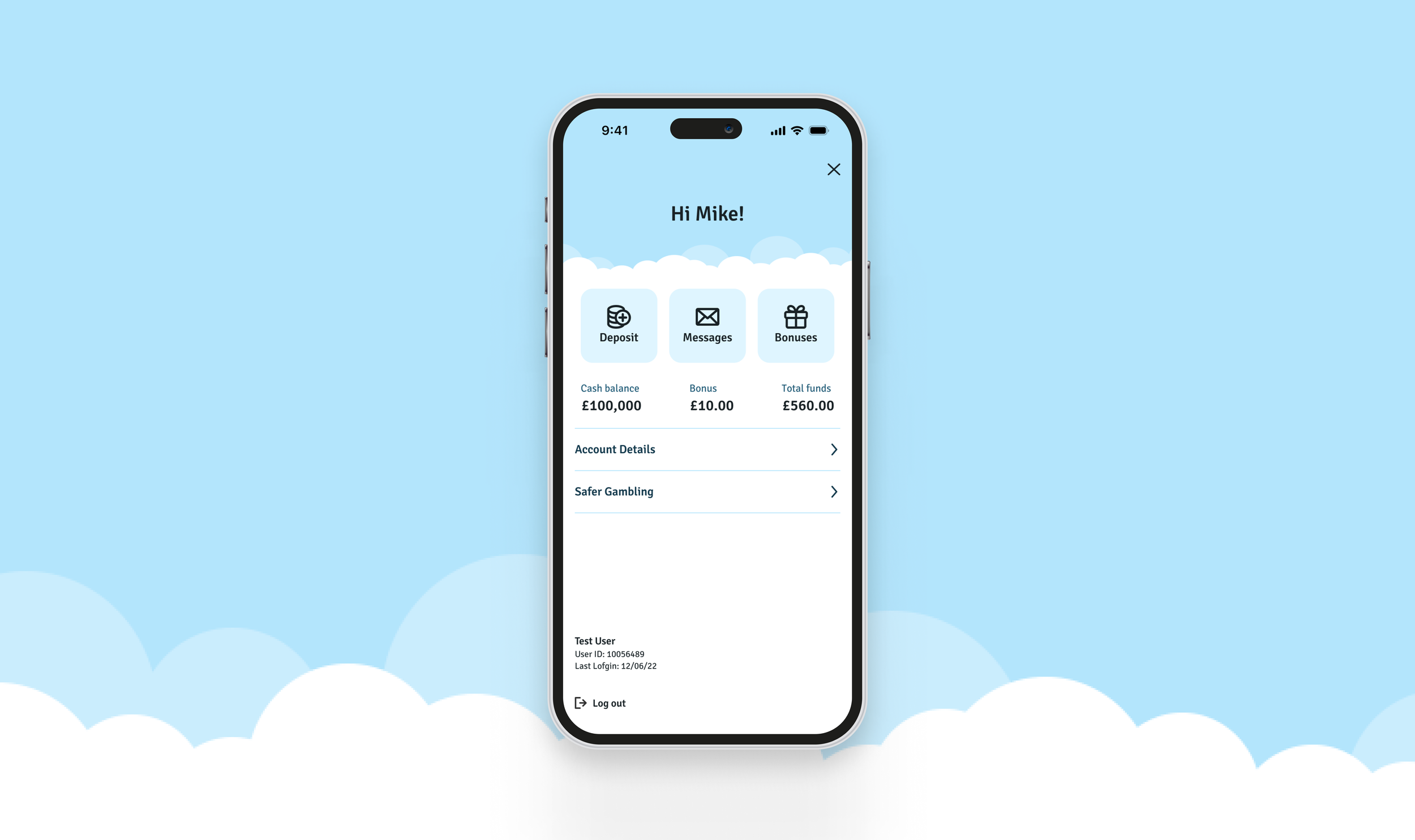
User flow 1 — Product selection
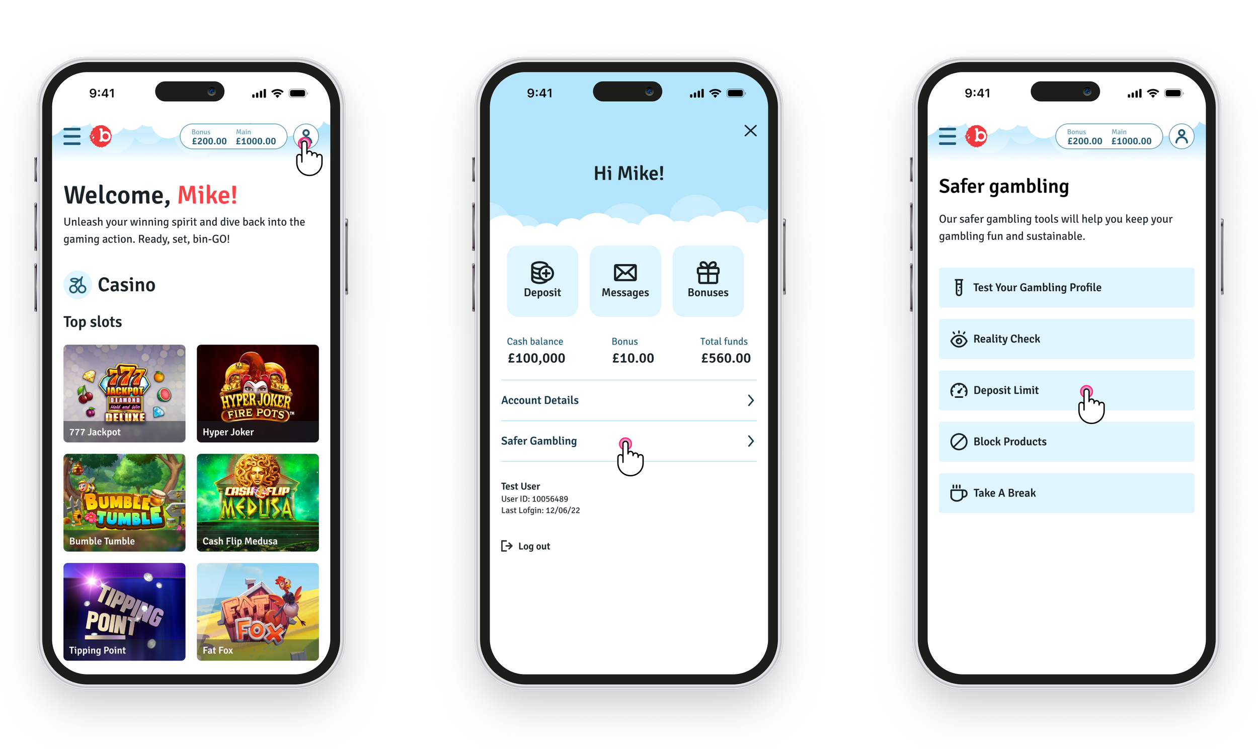
User flow 2 — Accessing safer gambling tools
Validating the solution
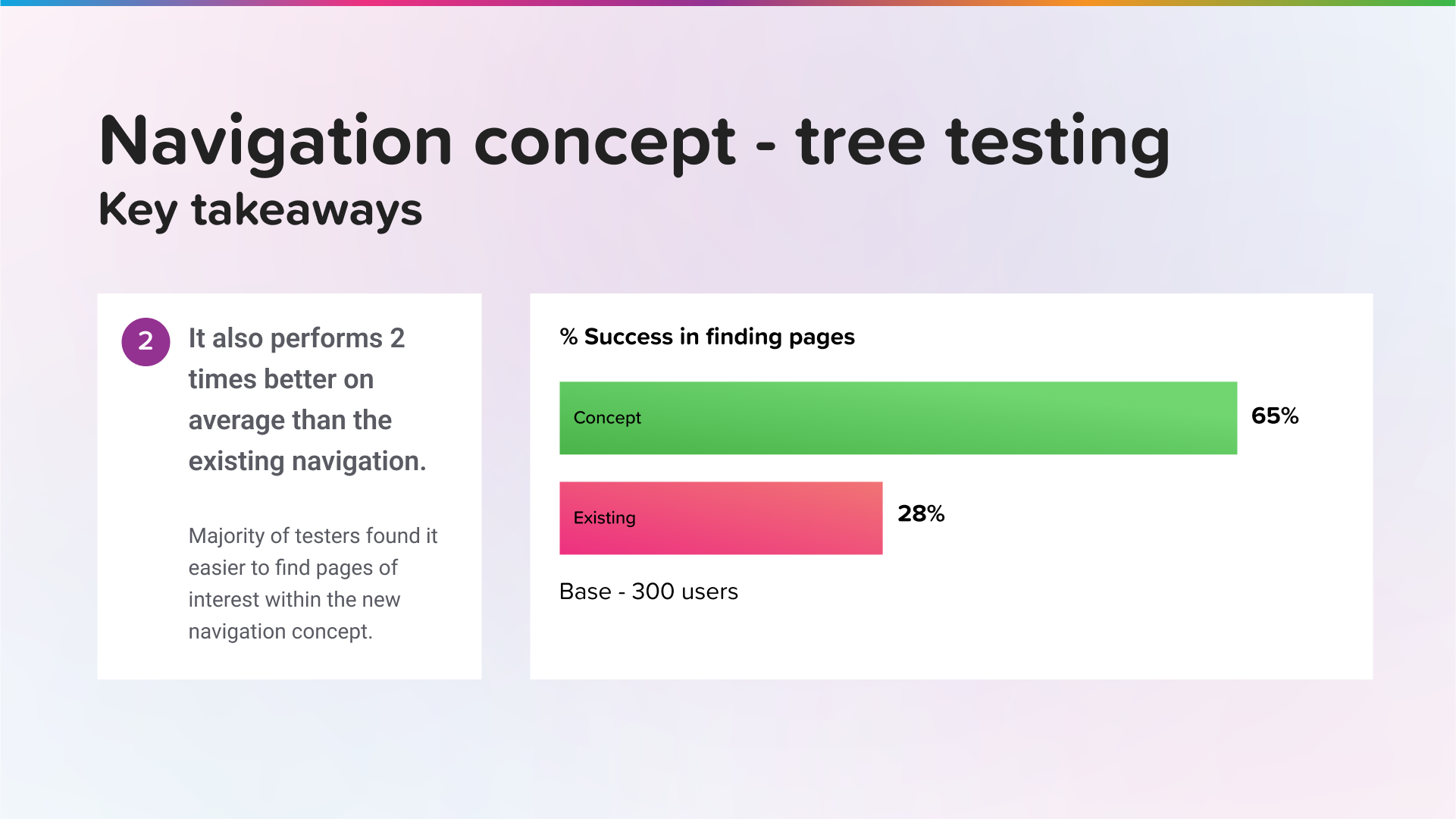
We conducted a final round of tree testing and usability sessions with interactive prototypes. Not only did the solution perform well—it outperformed the previous version across multiple KPIs (e.g., task completion rate, time on task).
The repeated success across two major brands and several markets gave us the confidence that this was a robust, multi-brand solution.
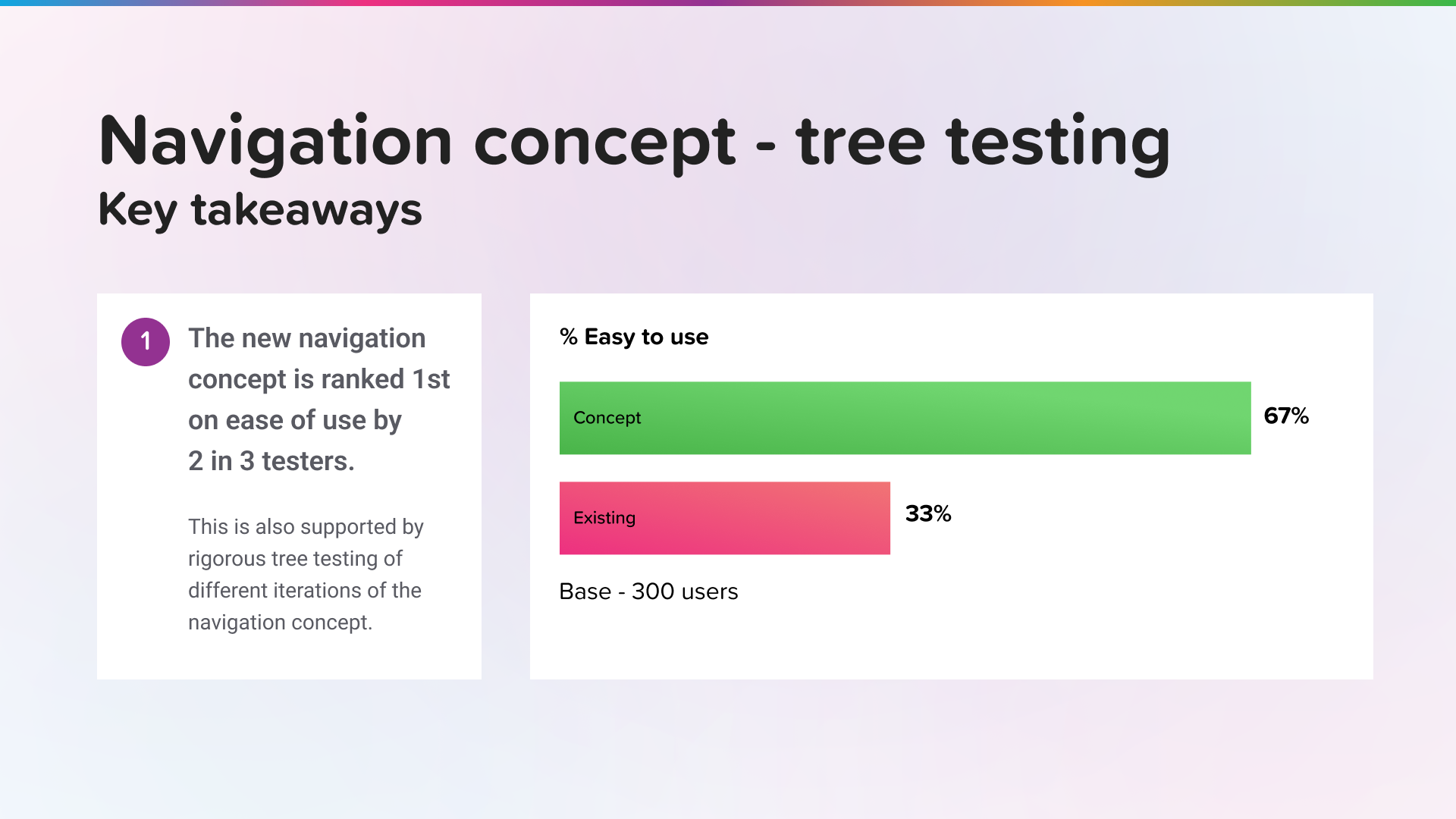
Key Takeaways — The navigation concept was considered easier to use
Key Takeaways — The navigation concept outperformed the legacy version

Key Takeaways — In some cases, findability increased, by up to three times
Scalable Rollout
Once approved by stakeholders, I created a brand-agnostic prototype to demonstrate how this navigation model could scale across different websites. Built in Figma with smart variables and interactivity, the tool enables internal teams to:
Preview their site structure
Configure category depth
See how products render in real-time
The new Kindred Web Platform is not only faster and more flexible—it’s also backed by a research-driven, intuitive navigation design.
Predicting Impact
While the platform is still being rolled out, early metrics already show an uplift in both navigation success rates and CSAT scores, indicating that users are finding the new structure more intuitive and satisfying to use.
With a clearer and more consistent navigation system, users are:
More likely to discover underrepresented products
Less likely to abandon their session out of frustration
Able to move more confidently between categories
We also expect to see ongoing improvements in our north star metric: the number of games played per session, particularly on mobile, where the new navigation has shown the strongest early performance.