
Scaling a multi-brand design system
My Role — Design, Architecture, Governance, Process
Impact
-35%
Design / development hours
-30%
Page load / FCT
-25%
Time to market / release
+25%
Accessibility compliance (WCAG AA)
+12
Net promotor score (NPS)
-15%
Support tickets related to UI/UX
Introduction
Design systems have always been essential for building products at scale — that part hasn’t changed. What has changed is how we use them. With AI and large language models becoming part of our everyday workflow, the push to automate and do more with less depends heavily on having solid, well-structured systems behind the scenes. So while design systems are still the foundation, their role is growing. Strong foundations make it possible to adapt quickly and handle change at scale.
Most companies say they have a design system or pattern library, but that can mean very different things depending on who you ask. Expectations vary, definitions vary, and the level of structure varies. In large organisations especially, the biggest challenge I’ve seen is the lack of a shared language between design and development. Different tools, different locations, and different interpretations of how things should work naturally create gaps.
To close those gaps, you need a single source of truth that reflects the real, live components our customers actually see. Working closely with developers, I helped create a design system that does exactly that. The Kindred UI-Kit is now well established and used by hundreds of designers and developers every day.
Application
The UI-Kit was built around three years ago, as a result of constant collaboration between design, development and domain architecture. The system is built using a React Framework which allows us to place ‘react components’ alongside our legacy code. This enables us to migrate products according to the company priorities, without having to worry too much about tech / design dept. We move forward incrementally, improving the technical solutions and the customer experience at the same time. This also gives the engineering teams autonomy over their own products and the abilty to release indepedantly.
Did I mention multi-brand? Oh, yes, we had eleven brands at the time this was created. With this in mind, I took the decision to introduce a ‘Vanilla Theme’. A brand agnostic approach, which supplies the 'blueprints’ that auto map to our other brands. When it comes to designing a product or experience you don’t have to recreate it ten times. You just need to specify what customisation is needed, for which brands, everything else follows Vanilla. Clever right? I thought so.
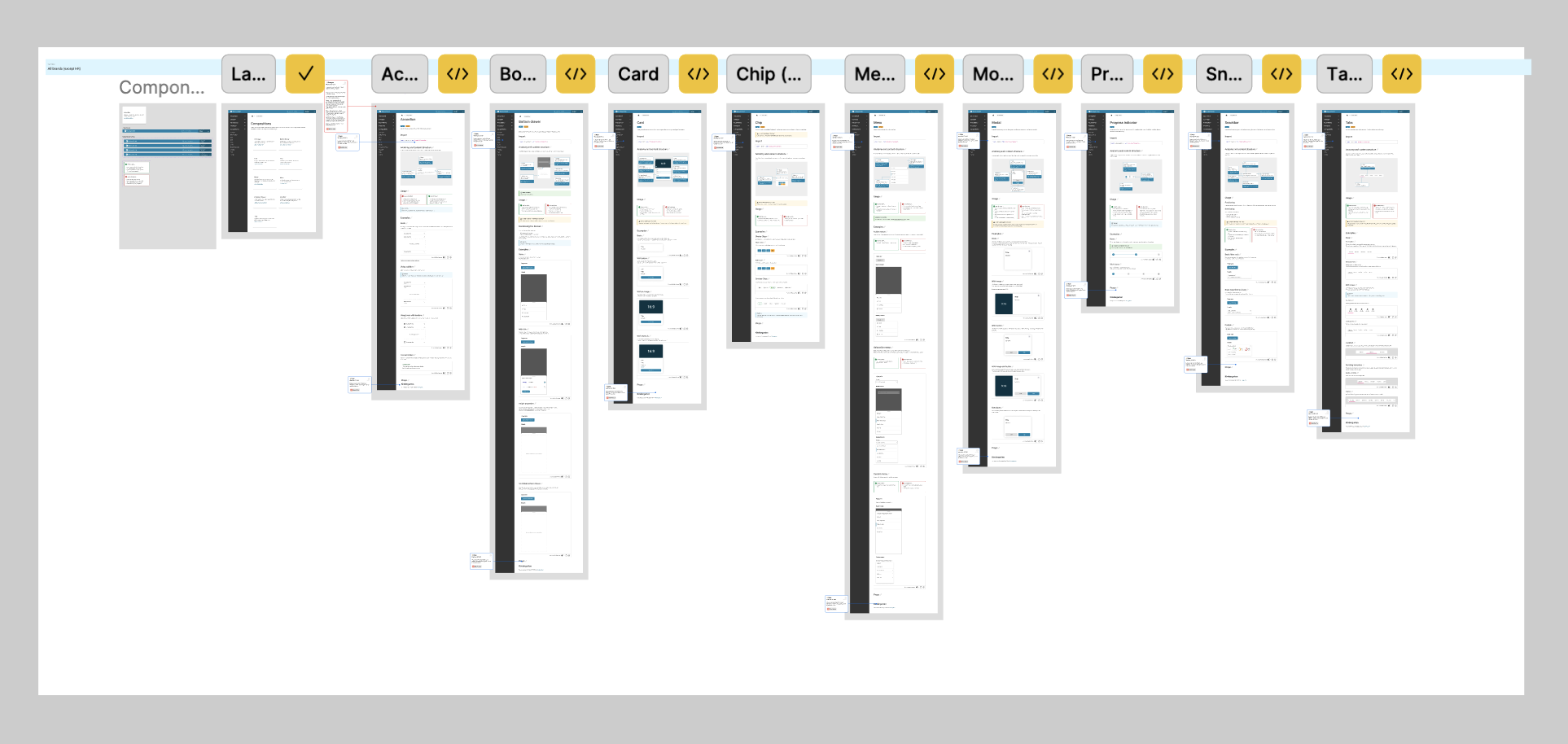
Documentation
We provide documentation within the UI-Kit itself, which tends to be more tech focused. Given that engineers are the majority of our audience (we ran a survey), it’s not a big problem. At the risk of the two sources conflicting, we also maintain Figma documentation. This includes the initial spec we provide to developers (spacing, styling, brand variants ect), as well as instructions on how and when to use the Figma components, for designers.
Helping other teams to build documentation and component libraries is an additional ‘service’ we provide. This is potentially more of a design ops type of role, but we have found it necessary to get buy in from around the business.
A lot of time and resource is spent keeping everything in sync and ensuring that our Figma files are not moving ahead of the UI-Kit (or visa versa). Designs ‘not matching the design system’ can be a hot topic and hard to manage in a large company. This is where governance and process become very important.
Iteration
Theming (dark mode)
As the obsession with dark mode continues, the pressure to support this feature (on web) is mounting. We have some functionality built in already, but we need to expand upon it. Ideally we would switch to tokenization (as per Atlassian), but that is not possible right now. We do have a nifty work around though, one of our developers have created a proof of concept that allow us to provide light and dark components, out the box. It also empowers developers to set their own colour for backgrounds ect. This all responds to a global command, that can be configured per product.
Content updates
Expanding the documentation, has been an iterative process focused on improving clarity, usability, and consistency. Initially, we prioritised documenting core components and usage patterns, but as the system evolved, so did our approach to content. We are now working to establish a more consistent tone of voice and visual layout across all pages, ensuring the documentation feels cohesive and easy to navigate. Alongside technical specifications, we’ve added practical tips, design rationale, and usage guides to help developers and designers apply components effectively.
Content updates, working process
Figma embed
As part of our initiative to foster closer collaboration with developers, we’ve embraced a mob programming approach—working together in real-time to solve design and implementation challenges. This hands-on approach has not only improved communication but also accelerated decision-making across teams. One of our latest achievements in this effort was embedding Figma directly into our documentation, allowing developers to interact with design files alongside code references.
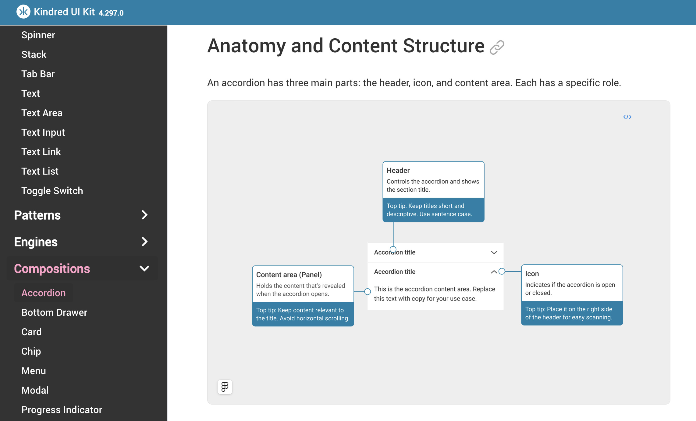
Using Figma frames, within our documentation
Governance
Governance works well when people feel empowered, I aim to lead by example and allow others to build on the ‘best practice’ provided. Some individuals / teams can be resistant to following a set of rules each time they design / develop. Hosting open forums where people can speak freely and have a say on how our design system works has been helpful.
We need to get everyone on board when it comes to evolving our workflow and contributing to ways of working. This can be challenging. Product teams will often prefer to ask a central team to make changes for them, which is understandable. However, this can cause conflict if they are not placed at the ‘front of the queue’. To alleviate this issue, we now encourage teams to create their own ideas (based on acceptance criteria) and submit them for integration into the central library. This workflow is more desirable and has been successful at Kindred. As with all good design we rely on open communication and building good relationships, above all.