
Building the Unibet iOS design system
My Role — Design, Architecture, Governance, Process
Impact
A systematic approach streamlines design, standardises development, and enables reusable components, accelerating releases across markets while ensuring consistency and scalability.
-30%
Design / development hours
-20%
Time to market / release cycle
+2.5
Increase in app store rating
Introduction
We don’t need (or want) to change much of the framework provided by Apple. However, we must work with developers to establish a best practice and communicate ways of working with design and engineering teams.
As the Principal Designer heading up a team with a central focus, it is my responsibility to own this process. The first step is to communicate ways of working and justify the methodology. Once this is established we can start providing documentation.
Design communities — “Do we really need a design system for iOS, given that Apple already provides its own design system?”
Central component team —“Yes we do, the guidelines provided by Apple are comprehensive, but also very broad. They are intended as a guideline and can be interpreted in different ways.”
Methodology
Scale
Multi-brand is a big focus at Kindred right now. We need to deliver quickly across multiple brands and markets. In order to make this happen efficiently (while also avoiding technical debt) we need a central team to be held accountable for maintaining the design system.
Consistency
Apple provides the native components out the box, and they are great, so we don’t need to change them. However, we need to explain how everything works, provide guidelines and naming conventions. Above all we need to create documentation to ensure we have a common language. That is actually the most important part, in my experience.
Accessibility
Accessibility matters, but has often been given a back seat. Until now, with legislation already passed in North America making this a legal requirement in some states. It is therefore imperative that we can support accessibility features, going forward.
Dynamic colour
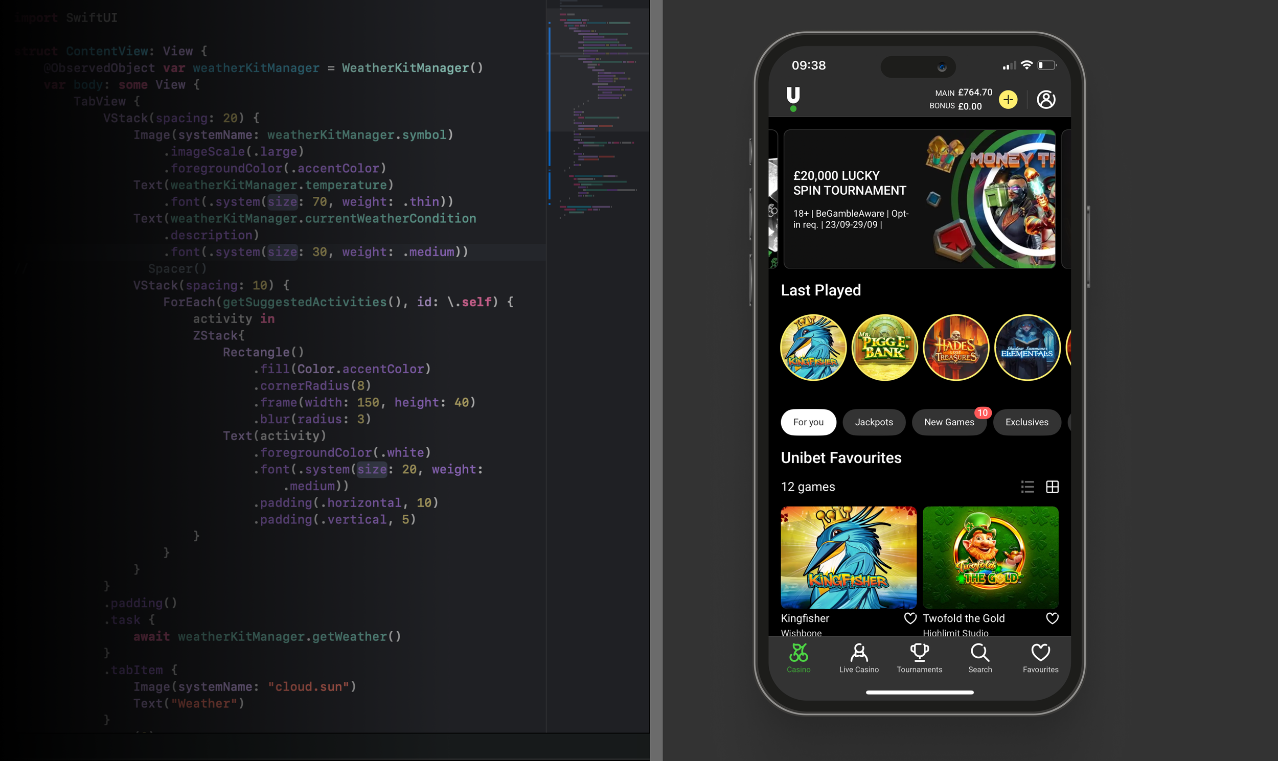
Dark mode is not exactly new news, but still a very important feature for users. Plus everyone in our company seems to be obsessed with it, for some reason. Either way we need to support it, which can be difficult if you are trying to accomodate legacy code. The only option is to start from scratch and encourage teams to opt-in to the new design system.
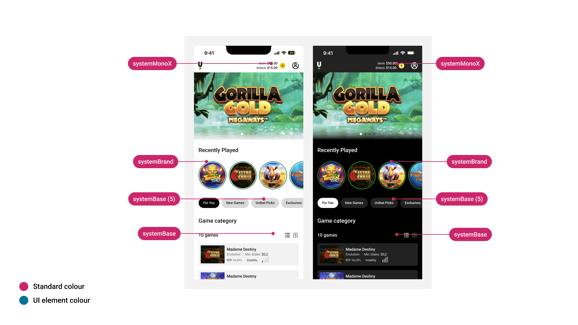
Applying ‘Standard Colours’
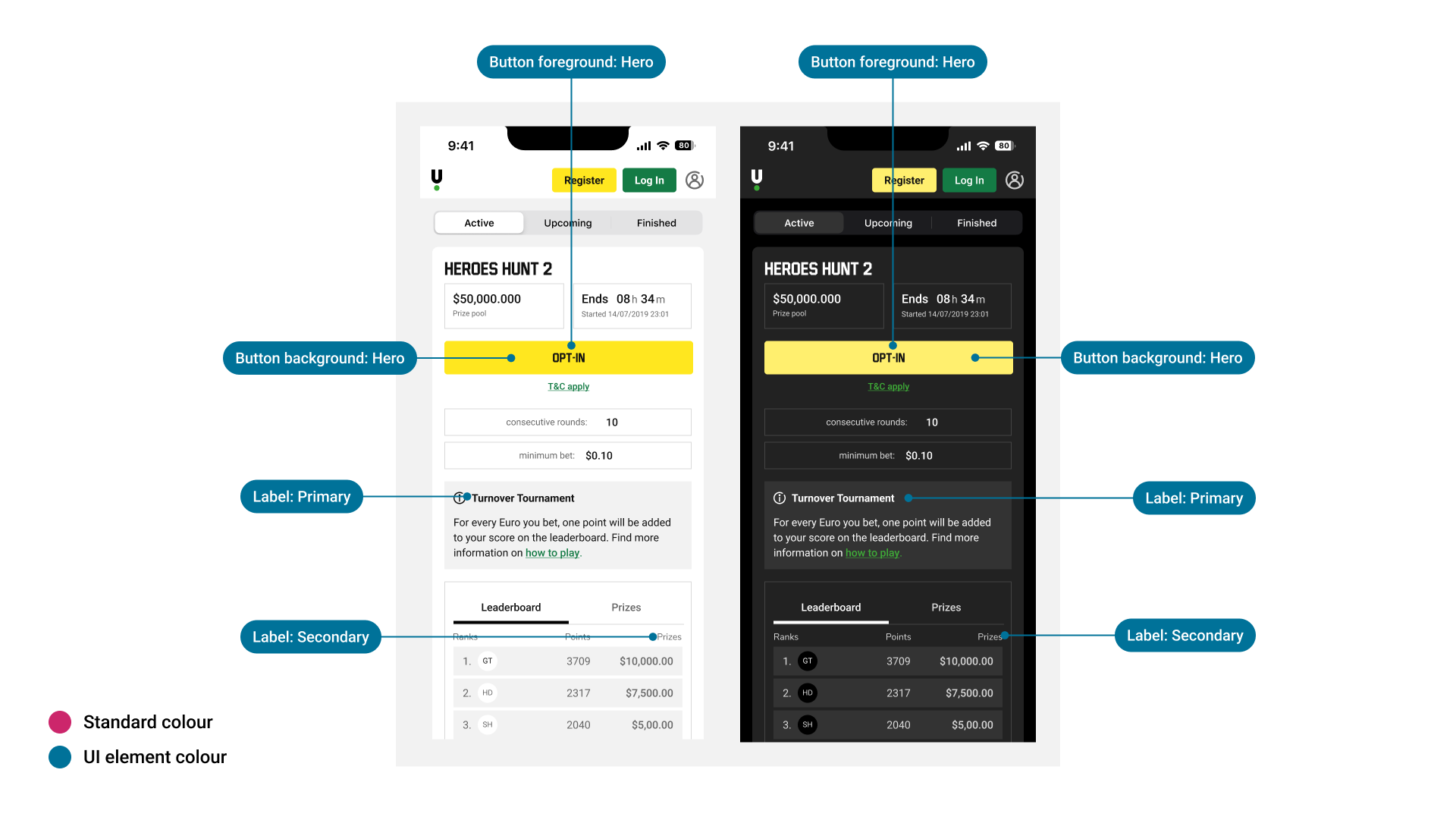
Applying ‘UI Element Colours’
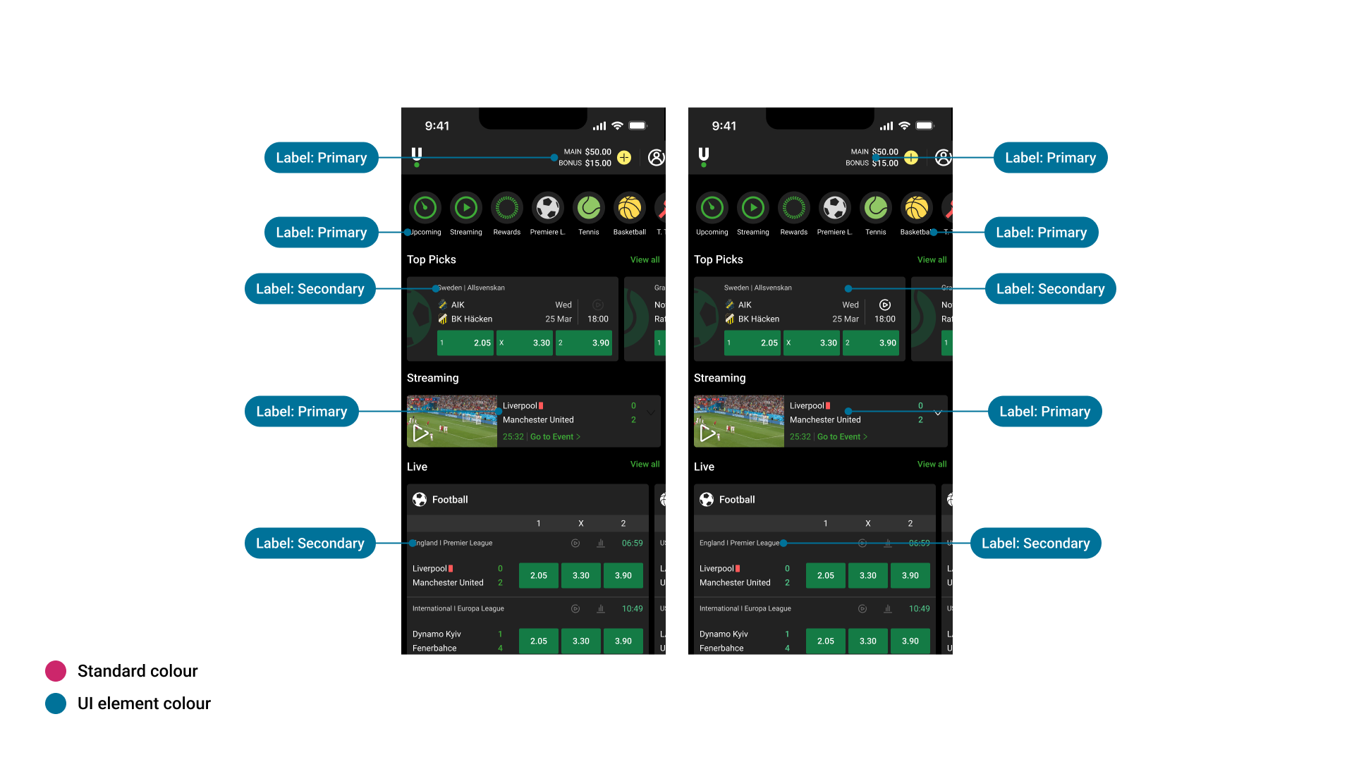
Applying colours to typography
Components
The Foundational elements are perhaps the most complex (colour typography ect), as they have to be implemented correctly in order to ‘cascade down’ across all our other components. This becomes even more complex when you add multi-brand into the equation. We have created extensive documentation to explain how our our implementation of dynamic colour works (see above). This has helped design communities to improve their specification and prepare for the multi-brand revolution!
There are already official Figma Libraries available for the various releases of iOS. We can use them, but we need to be careful. For example — new tools such as ‘Tip Kit’ are only available on iOS17 and above, so how does that affect our implementation? We can alleviate this ambiguity by providing our own iteration of the iOS component library which helps to explain the difference in our current implementation vs what comes out of the box with each release of iOS.
Finally, we need to consider customisation. This is something we want to limit, but it can also be essential from a brand perspective. There are various custom ‘bits and pieces’ that we need to keep in place, but that all has to be justified explained within the central documentation.
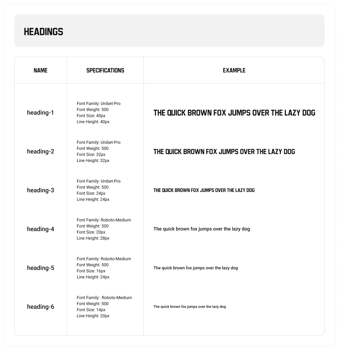
Typography
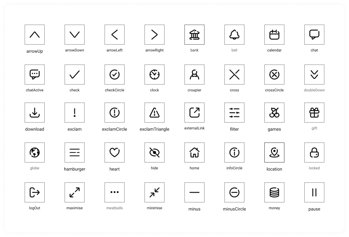
Icons
We are live
V1 of our iOS design system is already live in production. It’s still early days, but it’s proving effective. Designers are actively using the system in Figma, and developers are steadily rolling it out across the app.
One of the most immediate benefits we’re seeing is the removal of legacy components in favor of clean, pure native elements. The video below showcases updates to the tab and navigation bars, which now make use of the opaque appearance introduced in iOS 16 and above. You’ll also spot a few of the new components integrated into the layout — a nice preview of what’s to come.
And the best part? The app is now rated 5 stars on the App Store.