
Scaling a multi-brand design system
My Role — Design, Architecture, Governance, Process
Impact
-35%
Design / development hours
-30%
Page load / FCT
-25%
Time to market / release
+25%
Accessibility compliance (WCAG AA)
+12
Net promotor score (NPS)
-15%
Support tickets related to UI/UX
Introduction
Design systems have always been essential for building products at scale — that part hasn’t changed. What has changed is how we use them. With AI and large language models becoming part of our everyday workflow, the push to automate and do more with less depends heavily on having solid, well-structured systems behind the scenes. So while design systems are still the foundation, their role is growing. Strong foundations make it possible to adapt quickly and handle change at scale.
Most companies say they have a design system or pattern library, but that can mean very different things depending on who you ask. Expectations vary, definitions vary, and the level of structure varies. In large organisations especially, the biggest challenge I’ve seen is the lack of a shared language between design and development. Different tools, different locations, and different interpretations of how things should work naturally create gaps.
To close those gaps, you need a single source of truth that reflects the real, live components our customers actually see. Working closely with developers, I helped create a design system that does exactly that. The Kindred UI-Kit is now well established and used by hundreds of designers and developers every day.
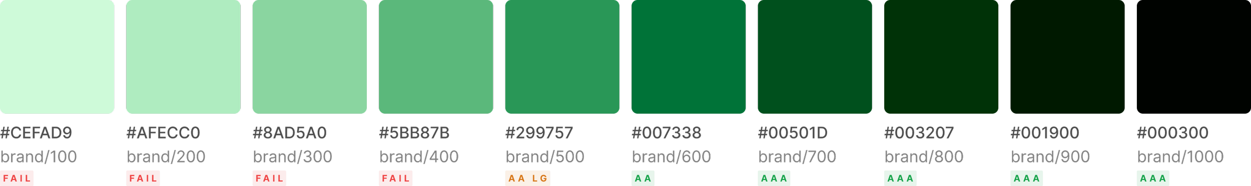
Colour: OKLCH
Why colour first
Colour was the right starting point — it cascades into everything else. And our RGB/HSB approach had a fundamental problem: accessibility was unpredictable. Different hues hit WCAG thresholds at different stops on the scale, which meant manual checking per hue, per brand, every time.
What OKLCH changes
OKLCH is a perceptually uniform colour space. Equal lightness steps look equally different to the human eye regardless of hue — a step from L=0.5 to L=0.6 is the same perceptual jump for green as it is for red or blue.
Because lightness maps linearly to perceived brightness, WCAG contrast ratios become predictable and consistent across every hue:
Stop /600 = WCAG AA guaranteed (≥4.5:1) for every hue
Stop /700 = WCAG AAA guaranteed for every hue
No per-hue exceptions. No manual checking.
The old approach hit AA at different stops per hue: brand/600 (5.32:1), accent/700 (6.31:1), neutral/600 (5.02:1). OKLCH eliminates that inconsistency entirely.
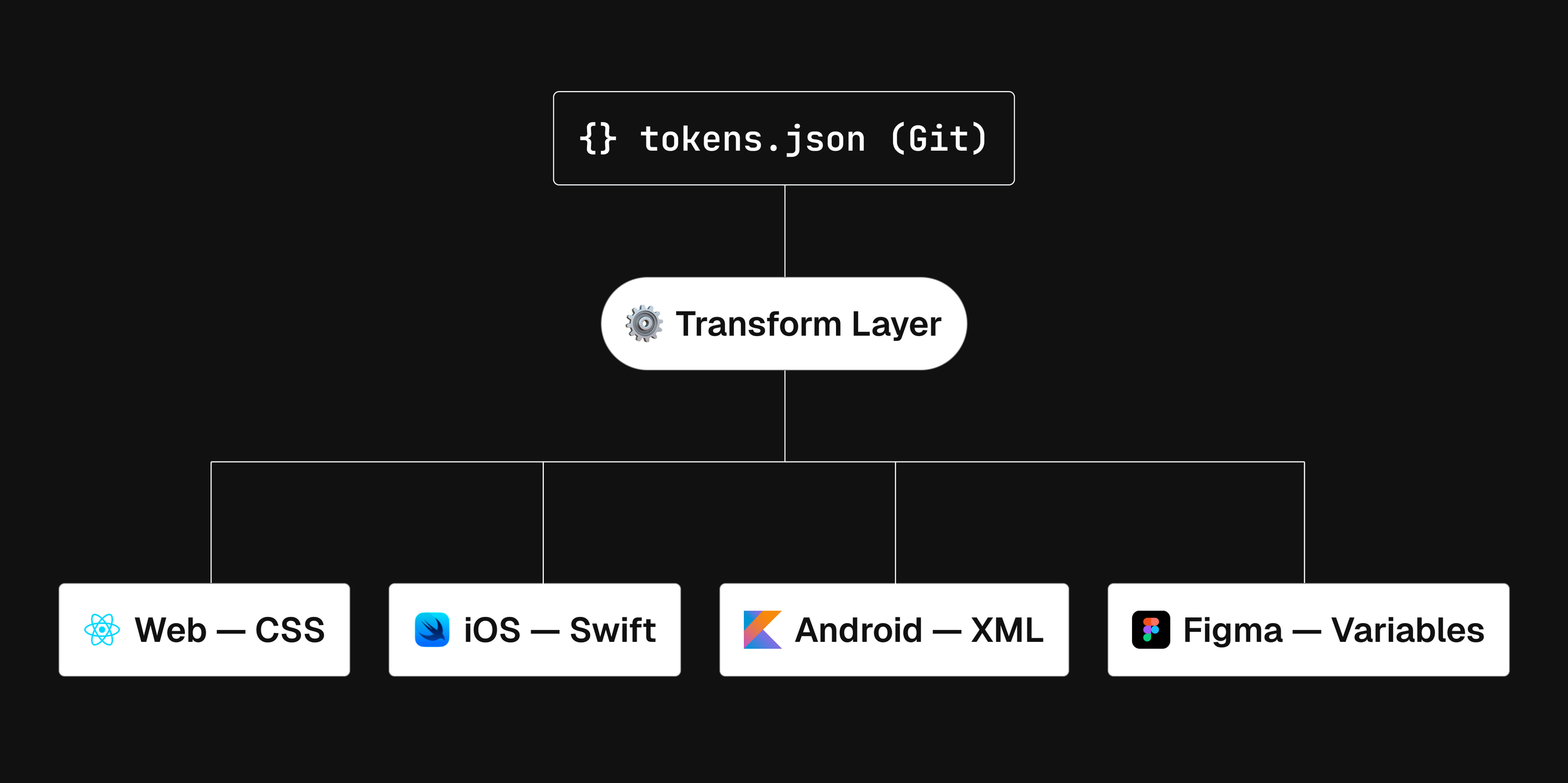
Token architecture
Three tiers, deliberately
Tokenisation gets complicated fast — four layers, component aliases, platform-specific exceptions. We made a deliberate decision to keep the system to three tiers:
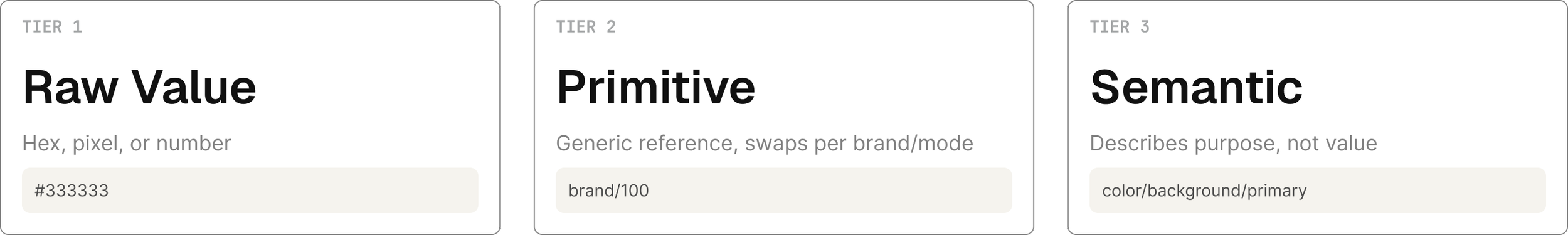
Primitive tokens are raw named values: color.blue.500 = #4466FF. Brand-agnostic, no implied usage. The full colour scale lives here — 96 colour variables across neutral, brand, accent, and supporting hues, plus spacing (18 values on a 4px grid), border widths, radii, and elevation.
Semantic tokens describe purpose, not value: color/background/primary, elevation/low, body/md. They reference a primitive. When brand or mode changes, the primitive behind the semantic token swaps — the token name never changes.
A component token layer is scoped for later. Getting the semantic layer right first is what makes it useful.
Using Figma frames, within our documentation
Governance
Governance works well when people feel empowered, I aim to lead by example and allow others to build on the ‘best practice’ provided. Some individuals / teams can be resistant to following a set of rules each time they design / develop. Hosting open forums where people can speak freely and have a say on how our design system works has been helpful.
We need to get everyone on board when it comes to evolving our workflow and contributing to ways of working. This can be challenging. Product teams will often prefer to ask a central team to make changes for them, which is understandable. However, this can cause conflict if they are not placed at the ‘front of the queue’. To alleviate this issue, we now encourage teams to create their own ideas (based on acceptance criteria) and submit them for integration into the central library. This workflow is more desirable and has been successful at Kindred. As with all good design we rely on open communication and building good relationships, above all.